Making speech therapy simple, curated and accessible

Project overview
Context
Speech therapy in Australia can be difficult to access. High costs, long waiting lists (sometimes up to a year), and a demanding process often leave parents feeling overwhelmed and unsupported. Meaningful progress requires daily practice at home alongside weekly sessions with a therapist.
The exercises provided by therapists are often paper-based, repetitive, and not engaging for children, making consistent practice a real challenge. Therapy sessions themselves are long and data-heavy. Therapists spend significant time asking parents how often they practised, when they practised, and how their child responded throughout the week. Managing detailed reports, assessing each child, and tailoring exercises make the process demanding for therapists, too.
The opportunity
The team is building a digital platform for children, parents, and therapists, designed to transform traditional paper-based speech therapy exercises into interactive and engaging digital experiences.
The platform aimed to use AI to personalise each child’s learning journey based on their progress and performance. For families on waiting lists or unable to access therapy immediately, it offered a way to begin speech therapy earlier. For children already working with therapists, it served as a collaborative tool that connected therapists, parents, and children within a single ecosystem.
Impact and value
Personalised learning pathways: AI assesses each child’s progress and continuously recommends suitable exercises and learning units.
Improved accessibility: Families can begin therapy before gaining access to in-person services.
Increased consistency: Interactive, gamified exercises encourage more regular home practice.
Reduced parental stress: Clear guidance and progress visibility help parents feel more confident and supported.
Lower therapist workload: Automated tracking reduces manual reporting and preparation time.
Better collaboration: Parents, children, and therapists stay aligned through one connected platform.
How I joined the project
When I joined the project, the team had already begun exploring the product direction and had created several initial Figma screens.
I was initially asked to help prototype the existing designs for a few weeks. However, once we reviewed the screens more closely, it became clear that the challenge extended far beyond prototyping.
The screens represented isolated features rather than a structured product experience. There was no clear logic behind the flows, no prioritisation framework, and many foundational questions remained unanswered.
How the project expanded beyond UI design
As we dug deeper, the complexity of the product expanded significantly. We uncovered challenges across multiple layers of the experience:
Different therapists followed different treatment philosophies. Some strongly believed in home practice, while others did not.
Exercises needed to remain clinically accurate and aligned with therapeutic standards.
The platform had to fit naturally into therapists’ existing workflows, introducing major service-design considerations.
The product needed to support children across a very wide age range — from 3-year-olds to teenagers.
Interaction patterns, motivational systems, and gamification strategies varied dramatically across age groups.
Many parents joining the platform were still on therapy waiting lists and lacked clinical terminology or professional guidance.
Reward systems needed to motivate children without adding pressure for already overwhelmed families.
The deeper we explored, the clearer it became that trying to solve every problem at once would create an unfocused product.
Defining focus
To avoid losing direction, we returned to a simple but important question:
Why does this platform exist?
One of the strongest value propositions was helping families begin speech therapy before or without gaining access to a therapist.
This became our north star.
Rather than designing equally for therapists, parents, and children from the start, we prioritised the parent and child experience first.
We also narrowed our focus to children aged 6–8 years old.
This decision helped us:
Conduct usability testing more effectively
Gather feedback faster
Design more targeted interaction patterns
Simplify gamification and reward systems
Reduce complexity during the early stages of the product
The 6–8 age group also represented a high-demand segment where many families were actively seeking support.
By narrowing the scope, we were able to design a more focused and testable experience instead of building a broad system that tried to solve every possible use case at once.
Research and discovery
Alongside the strategic discussions and prioritisation workshops, I researched both speech therapy and educational platforms to better understand existing patterns, behaviors, and opportunities.
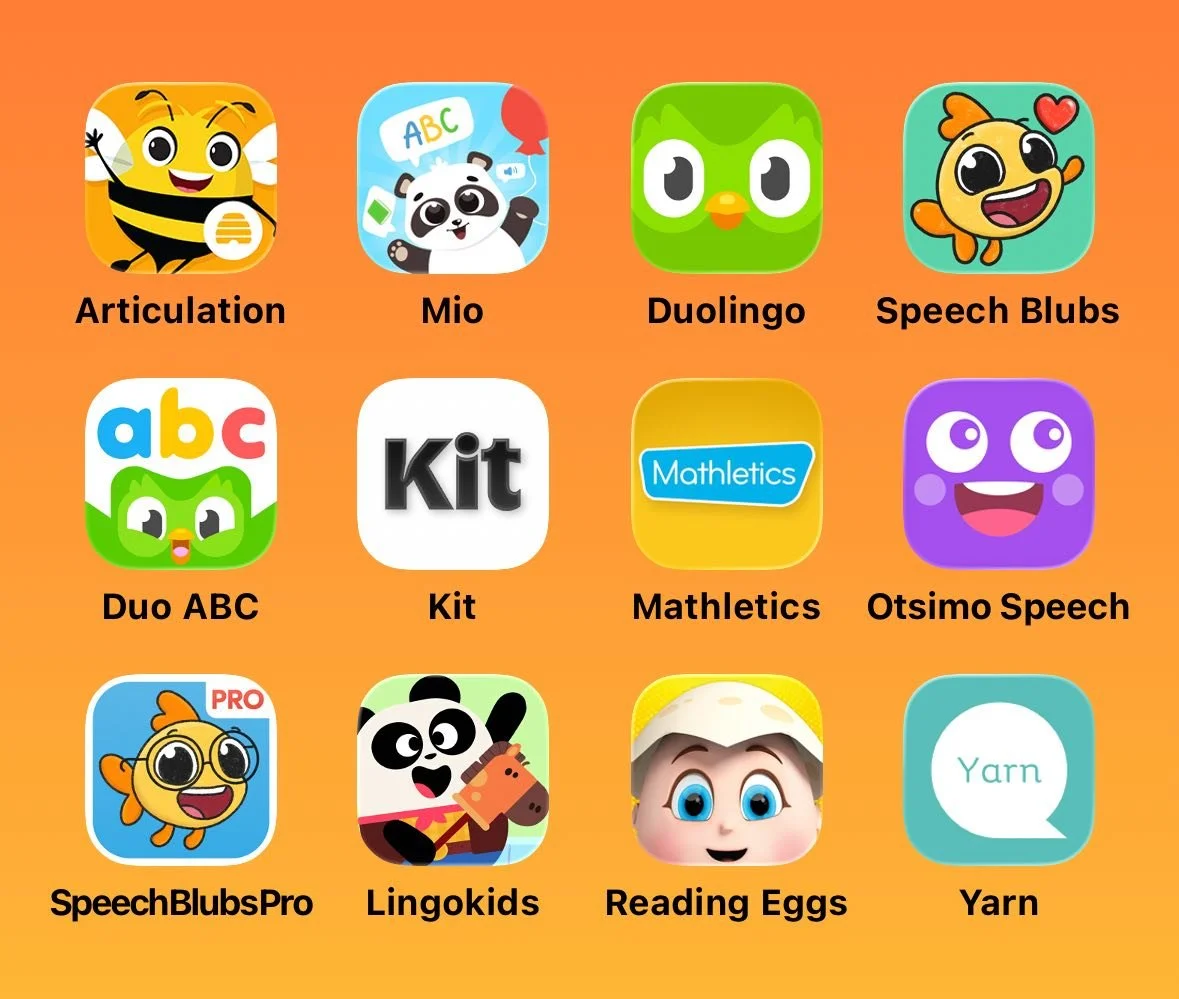
I explored how similar products approached:
Educational content presentation
Reward systems and engagement strategies
Interaction design for children
Information architecture
Navigation patterns
Onboarding flows
Multi-child account management
Parent dashboards and progress tracking
This research helped establish baseline expectations and common interaction patterns used across educational products.
Alongside competitive and comparative research, I also gained insight from
Interviews with speech therapists
Usability testing reports
Parents feedback sessions
Key insights
Parents need clear visibility into home practice, specifically when the last session took place, which activities were completed, the accuracy percentages, and the time spent.
Learning units fall into distinct categories, including articulation, language building, and comprehension. Parents need an intuitive way to navigate across these categories.
Parents have very different relationships with pressure. Some want to go beyond the minimum requirements, while others feel overwhelmed and simply need clarity that their child is completing what is necessary.
Some families have more than one child with speech delay, so the system needs to support seamless switching between multiple child profiles.
These inputs helped ground the product decisions in real experiences rather than assumptions.
Design solutions for the parent portal and some of the key screens
Based on these insights, I designed a set of mid-fidelity prototypes focused on the parent experience and core learning flows.
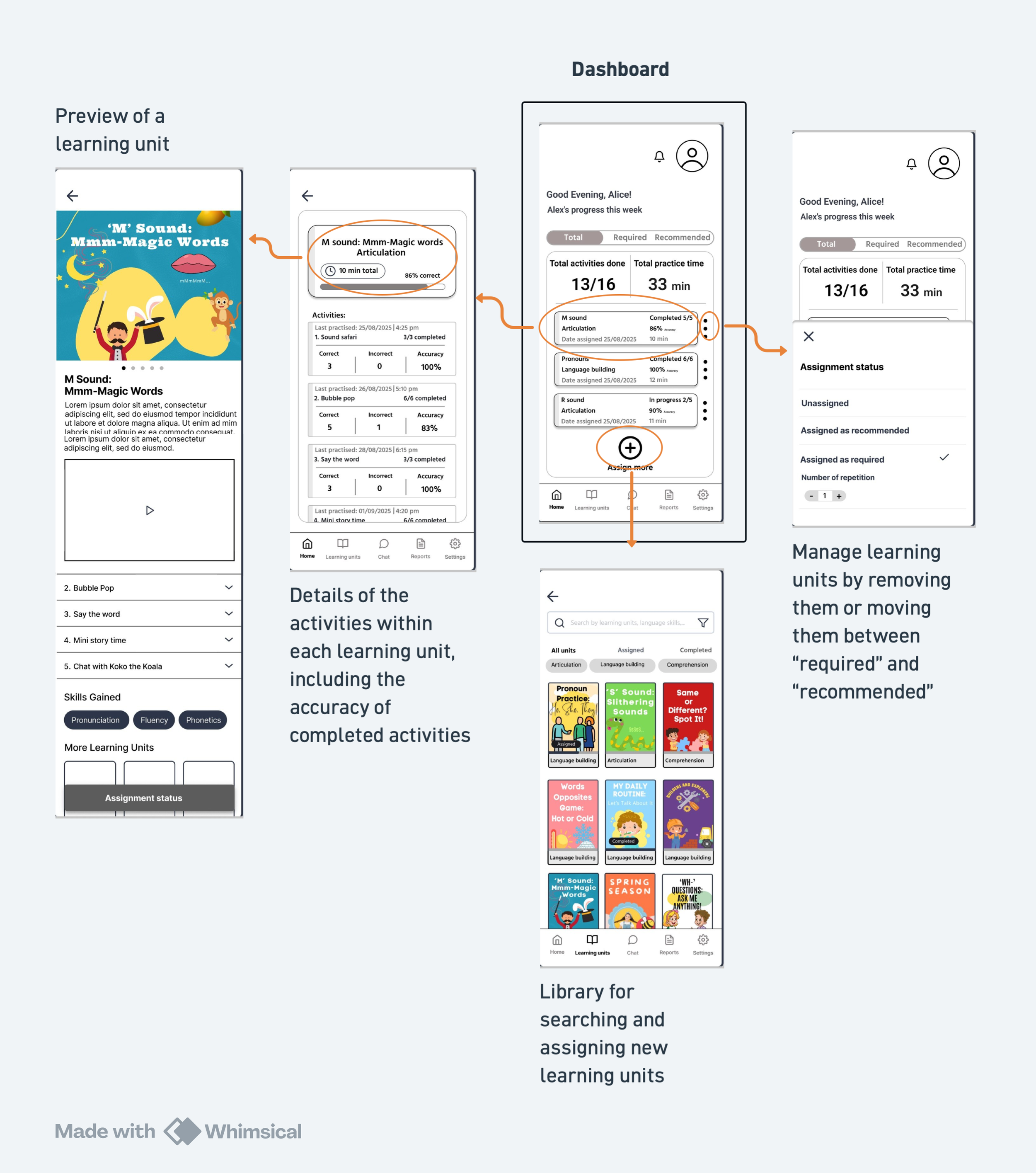
The dashboard
Every decision within the parent dashboard was shaped by insights from both parents and therapists, even though therapist-facing features were planned for later stages of the product. From the beginning, we designed the experience with future therapist integration in mind.
What can parents do from the dashboard?
The parent dashboard was designed to give families both visibility and flexibility throughout the therapy journey.
Parents can:
View accuracy scores for completed learning units
Track total practice time
Monitor overall progress across learning units and categories
See which learning units are completed, remaining, recommended, or required
Preview assigned learning units
Assign new activities or remove existing ones
Move activities between “recommended” and “required” to better manage practice pressure and adapt the experience to their child’s needs
This flexibility was particularly important because research showed that parents experience pressure differently. Some wanted to go beyond the minimum recommendations, while others primarily needed reassurance and a manageable routine.
Profile and child switching system
The platform uses a dual-layer switching system to support different contexts within the same account.
First, it follows a familiar profile-switching pattern inspired by platforms like Netflix, allowing users to switch between parent and child modes through an avatar-based interface. In many cases, the same device is shared within the household, as families may not have access to separate devices for each child.
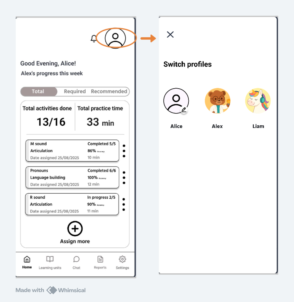
Switch profile
In addition to this, families with multiple children can switch between child profiles through the settings section. This ensures that the dashboard, progress data, and learning recommendations always reflect the selected child, keeping each child’s therapy journey clearly separated.
Together, this structure supports both shared-device usage and multi-child households without adding complexity to the core experience.
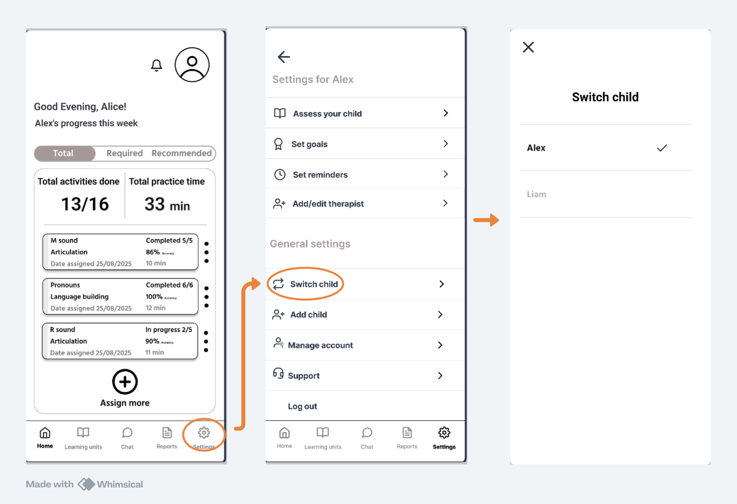
Switch child
Learning unit management
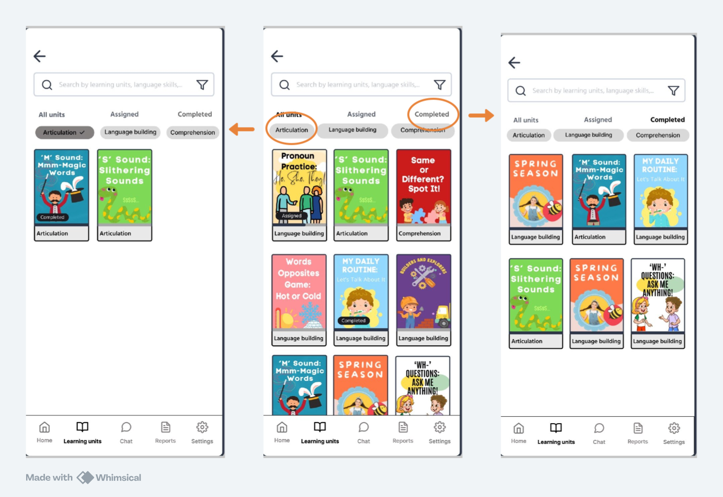
Parents can search, filter, and assign learning units from a central pool of learning units. Units can be filtered by category (e.g., articulation, language building, or comprehension) and by progress status (e.g., assigned or completed). This gives parents meaningful control over their child’s learning experience without making the system feel overwhelming.
Status
This is a live project currently in development.
The Parent Portal is in its latest iteration. We've handed over mid-fidelity prototypes to university student developers to build and deploy through an internal App Store Connect testing group for iOS usability testing.
The next phase of the project will focus on designing the Kids Portal and Therapist Portal.