Life of colors Boutique Supplier
of Unique & Modern Art
I turned high-traffic blog content into product conversions
Team
Soudeh Granpayeh, UX consultant
Paddy Ferguson, UX consultant
Duration
3 weeks
Tool
Figma
Whimsical
PROJECT OVERVIEW
Context
Five years ago, Life of Colors began as a small online business with a single product—paint pens. Today, it has expanded its range to provide a complete creative experience.
Despite the brand's growth, the website fails to effectively showcase its diverse range, missing key opportunities to engage and convert visitors.
Observation
The website already receives good traffic, but much of it doesn't convert into purchases.
Visitors often come for specific content (like blog posts) but don’t explore or buy products.
Business goals
Turn existing traffic into paying customers
Raise awareness of their product range
Maximise email collection for marketing
Projects constraints
Design limitations within Shopify
Since the client's website is hosted on Shopify, which comes with predefined templates and features, we've been asked to focus on small adjustments rather than major changes.
Tight deadline
Only 3 weeks to complete the project and deliver a solution.
RESEARCH PHASE
Our research officially kicked off with a stakeholder interview. After they shared their goals and concerns, I asked lots of questions — about the business landscape, their constraints, customers, value proposition, previously tried solution, and current priorities. Their answers shaped and guided the direction of my research. From that first conversation, I was able to define the research statement and objectives.
Research statement
Why are users visiting the site but not purchasing—especially beyond the initial product they're exposed to?
Research goals
To understand why users weren’t converting, identify the barriers in their journey, and uncover actionable solutions to improve the experience and drive more purchases.
Finding where users might struggle
I conducted a heuristic evaluation to gauge the site’s current state and identify where usability issues may be emerging.
Key observation:
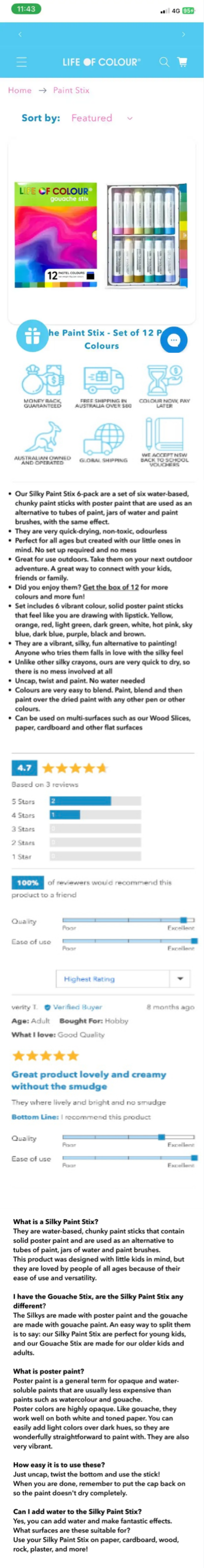
1. The product pages are hard to scan which makes decision-making difficult for users.
There’s too much cluttered information presented all at once
Poor prioritisation
2. Users can’t add items to their cart directly from the product range page, which adds unnecessary steps.

Learning from other brands
To gain some inspiration, I researched the business landscape, and I did that by conducting a competitive and comparative analysis. I looked at how other brands addressed similar design and conversion challenges, and how they promoted their product range.
I looked into three art supply websites (direct competitors) and one lifestyle retail brand:
Mont Marte
Poscart
Eckersley
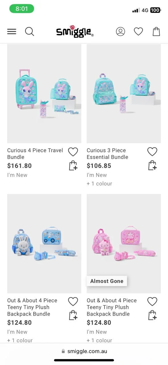
Smiggle –Although not a direct competitor, it offered useful inspiration
Why Smiggle?
I included Smiggle, a kid-focused stationery and gift brand, for two main reasons:
Effective bundling strategy –using themed product bundles to boost average order value.
Parent-friendly UX – While the brand targets children, the website is optimised for easy navigation by parents, who are the key user group for our client.
Key features that stood out across competitors & comparators
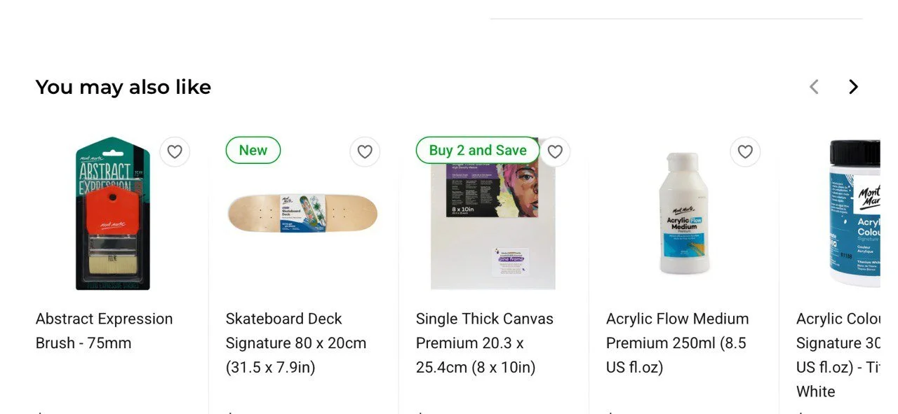
1. “You may also like” feature for product suggestion
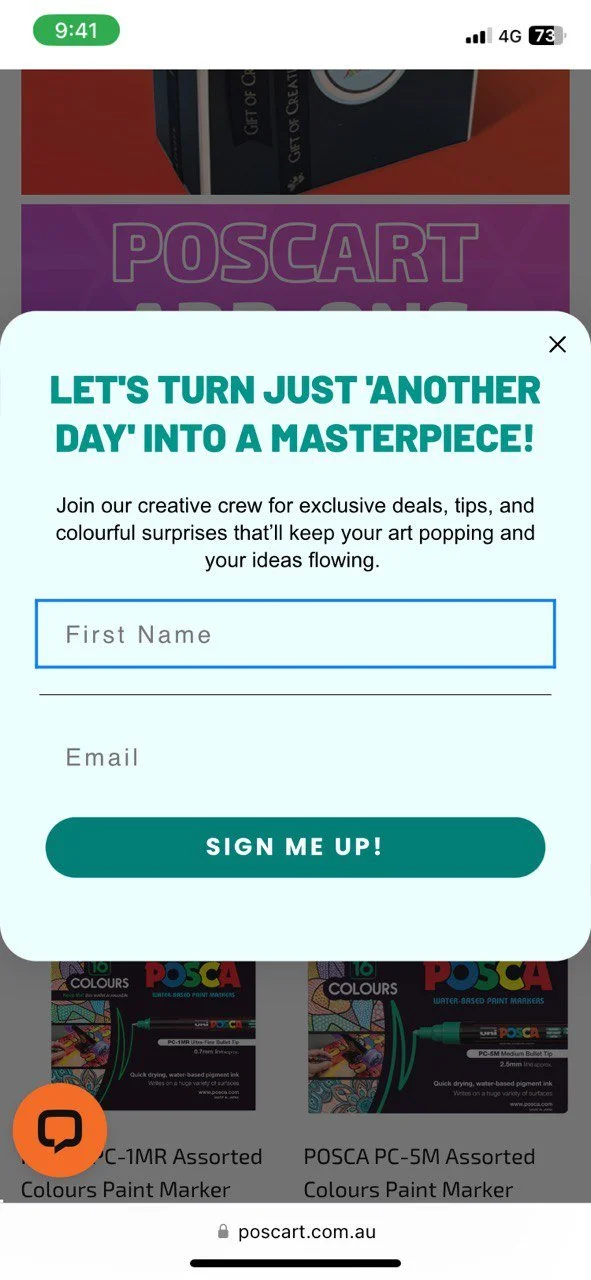
2. Prominent and well-timed email sign-up prompts
3. Gift bundles and curated sets to encourage product discovery and multi-item purchases
A missed opportunity in the journey
I did some retrospective research using Google Analytics to understand how people were using the website. It provided me with a clear picture of how users interacted with the site and which areas mattered most. One key insight stood out — many visitors were coming just to read the blog. It felt like a missed opportunity, so I started thinking about how to guide that traffic towards exploring the product range as well. The data also helped identify key user flows and raised an important question: how can we encourage users who come in for a blog post or a specific advertised product to explore further and make a purchase?
Key findings:
70% of users visited the site on mobile devices, highlighting the need to prioritise the mobile experience.
Around 30% of total traffic landed on the blog, yet these users rarely went on to make a purchase.
Users coming from paid ads typically purchased the specific product advertised—but rarely explored or added other items.
Key insight:
The blog page holds untapped potential as a conversion opportunity. It showcases DIY craft projects using Life of Color products, but the current setup doesn’t support a smooth transition from inspiration to purchase.
These insights helped me define two key pathways to explore:
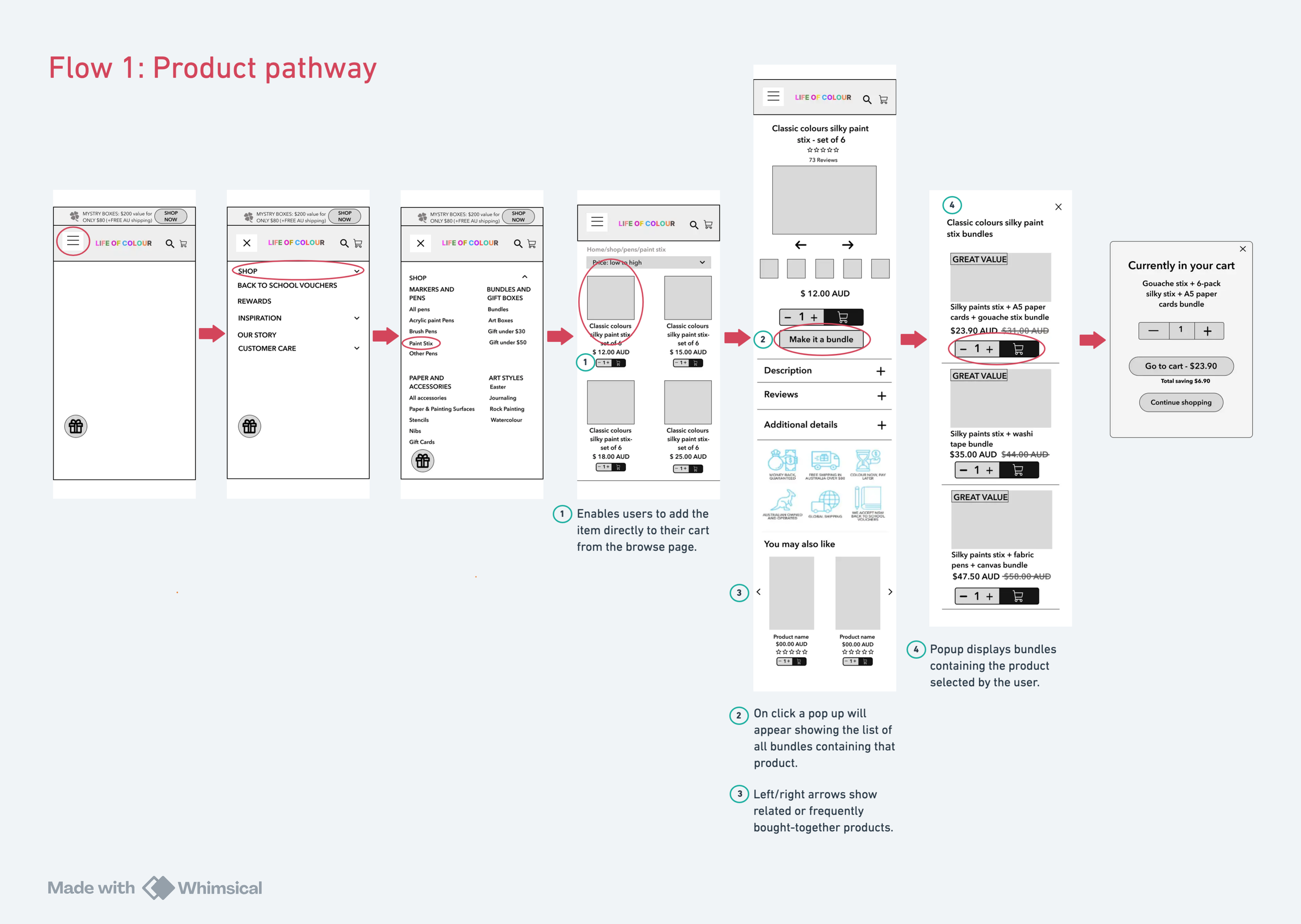
Product pathway – Understanding the journey from a paid ad to completing a purchase
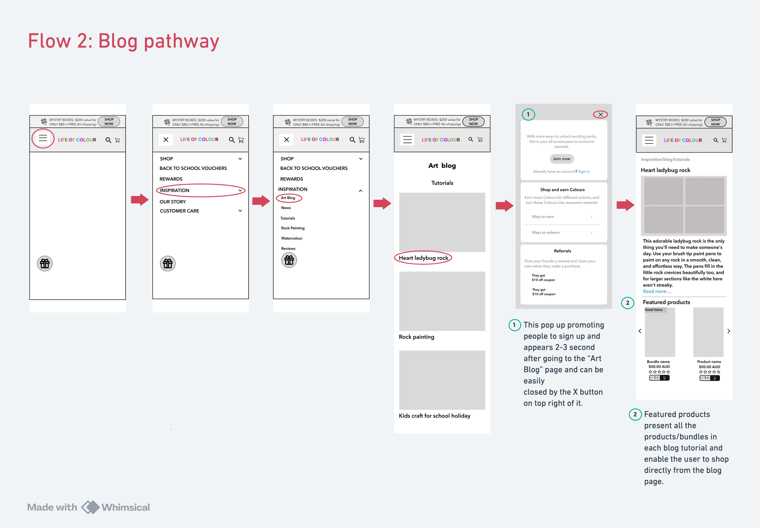
Blog pathway – Investigating how blog visitors engage with content and what stops them from buying the featured products.
Who are we designing for?
Through stakeholder discussions and analysis of client data, I identified two primary user types:

Lisa – The art enthusiast
Represents individuals who buy art supplies for personal creative expression.
Behaviours, needs, and challenges:
Shops regularly for herself
Has a clear idea of what she wants
Looks for variety, good deals, and high-quality products
Time-poor; wants quick updates on what’s new without browsing the whole site.

Helga – Family creator
Parents or grandparents who purchase art supplies for their children or grandchildren.
Behaviours, needs, and challenges:
Buys primarily for children or grandchildren
Prefers budget-friendly, mess-free, and long-lasting kits
Wants a simple and smooth shopping experience with minimal searching
User testing & scenarios
I tested the two real-world flows identified through the traffic analysis.
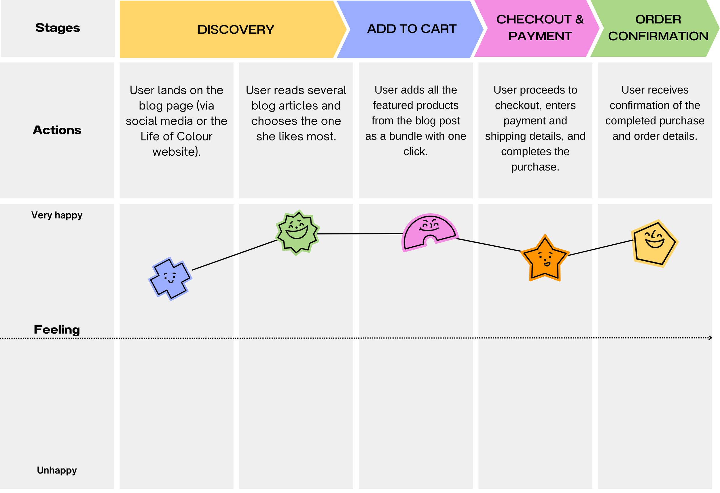
Flow 1: From the blog post to check out
Scenario
We asked 5 users to choose a blog post they liked and try purchasing all the featured products.

Key finding:
Users felt the process was confusing. They had to jump back and forth between the blog and product pages, which broke the flow.
Takeaway:
We need to make it easier to shop straight from the blog by clearly showing featured products and reducing page switching.
Flow 2: From Ad to Check out
Scenario
We asked 5 users to buy a product they were interested in, then explore other items.
We followed up with questions like:
“Do you feel like exploring more of the website?”
“What would encourage you to do so?”
Key Findings:
Most users did not explore further after finding the product they needed
They wanted a clear reason to keep browsing
e.g. discounts, or personalised suggestions
Without an incentive, users preferred to buy and leave
Takeaway:
To boost add-on purchases, offer the value upfront rather than expecting users to go looking for it.
Finding the bridge between the business and users through research
Through research, I worked to bridge the gap between the business and its users. By speaking with stakeholders, running usability tests, and analysing behavioural insights, I uncovered the core needs on both sides and aligned them to shape practical, high-impact solutions.

IDEATION & SKETCHES
1. Ideas for streamlining the shopping experience
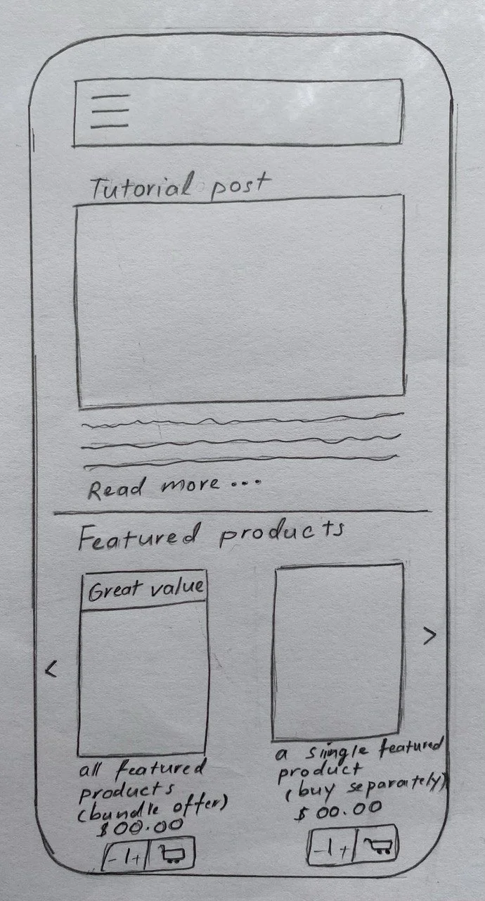
1.1 Direct add-to-cart feature for blog products
Implementation: Add functionality that allows users to add the products mentioned in the blog articles directly to their cart from the blog page. Offer options to add all the products as a bundle or individually.
Benefit: Streamlines the shopping process by reducing the need to navigate back and forth, enhancing user convenience and reducing frustration
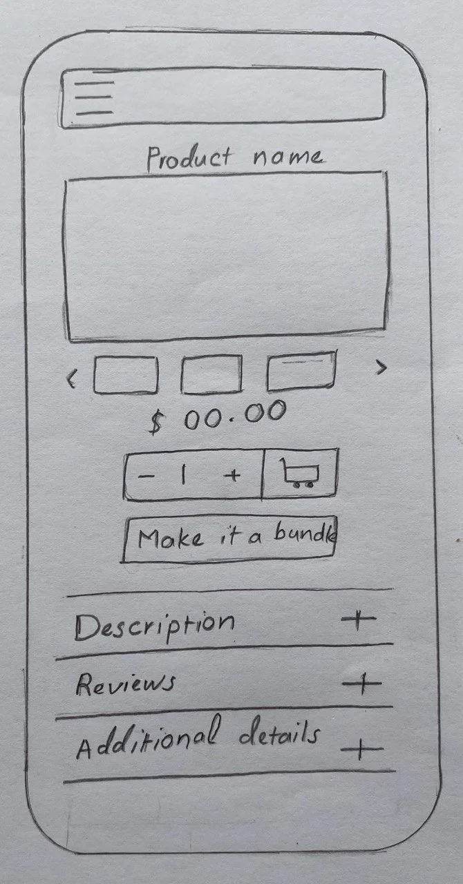
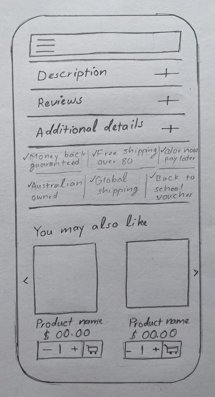
1.2 Accordion function for product descriptions
Implementation: Integrate an accordion function into the product descriptions. This will organise the large amounts of information in a compact space.
Benefit: Makes it easier for users to navigate and find the information they need without being overwhelmed by too much visible content at once.
1.3 Plus button on the product range page
Implementation: Include a plus button (+) on the product range page that enables users to add a product to their cart without needing to visit the individual product page.
Benefit: Simplifies the shopping process by allowing users to add products with fewer clicks, saving time and improving the overall shopping experience.

2. Ideas to increase product discovery
1.2 “You May Also Like” Suggestions on Product Page
Implementation: Display related or frequently bought-together products beneath each product page.
Benefit: Encourages exploration, product discovery and cross-selling, increasing order value and enhancing the shopping experience.
2.2 “Make it a Bundle” Feature on Product Pages
Implementation: Add a “Make it a Bundle” option on specific product pages. When clicked, users see a list of curated bundles that include the selected item, with a single-click add-to-cart option.
Benefit: Simplifies decisions, highlights value, increases product discovery, and boosts conversions.

3. Idea to increase email collection
Loyalty Program Pop-Up
Implementation: Add a subtle pop-up on blog pages inviting users to join the loyalty program for exclusive deals, early access, or rewards.
Benefit: Grows the email list, supports targeted marketing, adds user value, and does so without being intrusive.
FEEDBACK & ITERATION
Usability test
8 users were asked to compare the current and proposed sites. Each participant first navigated through both pathways on the current site and then repeated the process using the prototype, noting any areas they enjoyed or found challenging.
Suggestion for Improvement:
Users found the plus button for the add-to-cart functionality confusing and recommended using a cart icon to make the action clearer. (4 out of 8 users)
Positive Feedback:
Add-to-cart Functionality: Users appreciated the ability to add products directly to their cart from the product range pages, stating it would increase their likelihood of continuing shopping.
Bundle opportunities: Users liked making it a bundle feature, suggesting it would positively influence their decision to opt for bundle deals.
Featured products on blog pages: Users found the inclusion of featured products on blog article pages seamless, indicating it would highly increase their chances of purchasing.
Product page before user usability testingProduct page after usability testing
Changed to

Wireframes
After synthesising the feedback received from potential users, our team produced annotated wireframes that detail how a user would progress through both proposed pathways. These wireframes incorporate the insights gained and illustrate the user journey improvements.

Key considerations
Identify the most popular blog articles to include the featured products component.
Ensure users have the option to opt out of the rewards/loyalty program to maintain user autonomy.
Next steps
Share the designs with the current web developer to assess the difficulty and feasibility of the proposed changes.
If implemented, monitor the conversion rate changes associated with key targeted pathways.
Consider expanding and increasing the number of bundle deals if the proposed functionality proves successful.